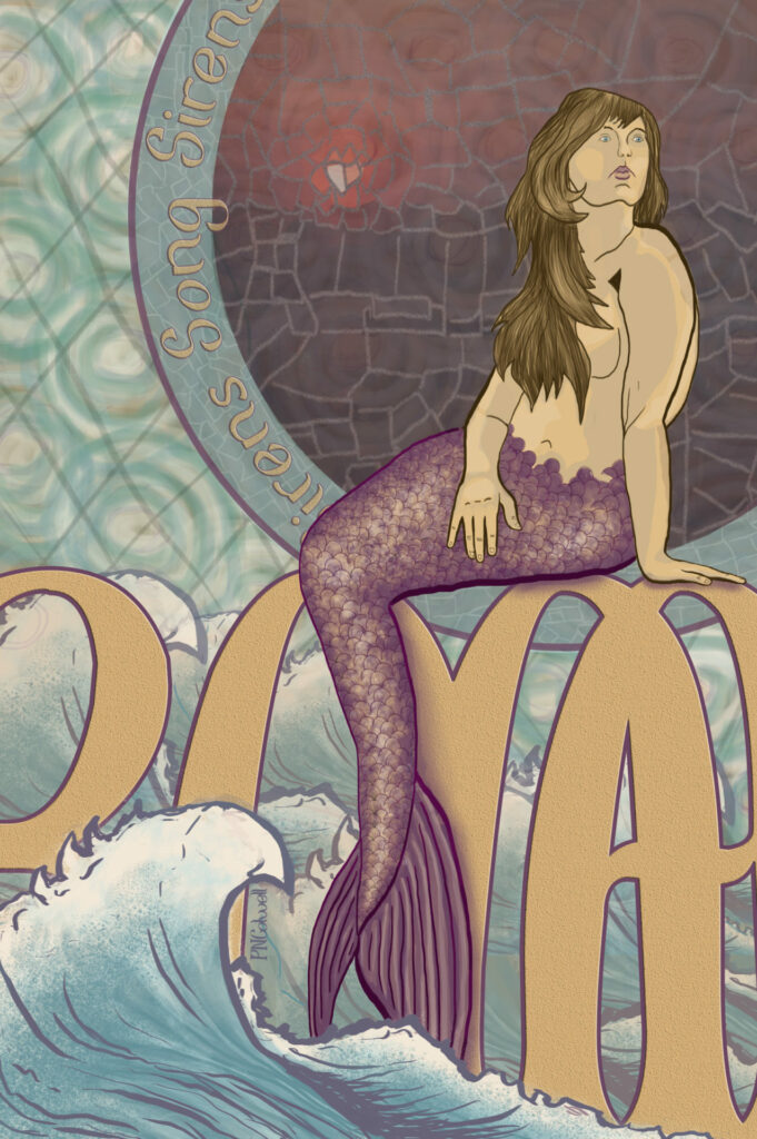
Ah yes I know, another mermaid.
Just keep swimming. Practice practice.
The font I used is called Fisherman. You can find it on Dafont. I liked it so I looked up the author (in my honest shame mostly to see what the copy right was) and was very impressed. The vector illustrations are nice! Click here to check out the artist.
There wasn’t much initial planning to this one. I had a bucket list of things I wanted to try and this was the result. It is inspired by Mucha’s Art Nouveau posters. I couldn’t help myself. I had to put my spin on that idea.
